After a while I finally found my groove as a writer and book cover designer. So by the time I got to my monster doorstop entitled: ‘Follow the Cobbler’ I knew a good photo (I happened to have one I had taken myself) and a great font style (thanks to my editor) I would have a cover in one image that told the story I wanted to convey. It wasn’t as easy when I first started out writing novels and plays and then deciding how to illustrate their covers.
My
first western was a good example of this. I wanted a front cover that really
told the story I wanted to tell. I thought the cover had to depict some
dramatic incident from the storyline. I figured an artist would have the talent
and skills to pull it off. I’ll never know if I was right or not.
My
encounter with three very talented artists all produced the same results. Each
artist insisted on first reading the novel and then 'telling me' what the cover
should look like. I tried it with one artist; a talented fellow from Northern
Minnesota, and after writing a $500.00 check I realized that was the wrong
direction to go for me.
The artist had done an acceptable drawing but totally missed the drama and emotional feel I was looking for. His painting looked like a cartoon drawing and would have worked for a comic book but not the serious authentic Western I felt I had written.
This
first novel had gone through many incarnations from first being written in
1973, typed out on an ancient L.C. Smith typewriter and stored away for 40
years. Its title ranged from ‘Man of Many Tribes’ to finally ‘Apache Smoke.’
The novel had been scanned into a computer from faded graying paper, edited
many times and was now ready for self-publication. What I needed was a great
cover to give the potential reader a hint at the action, suspense, and romance
inside. But how to do it in one set image; the book cover?
For the final cover, I had my editor use a photo I had taken at Joshua Tree National Park, colorize it, add silhouettes of three riders, smoke and mountains in the background. It was her idea to add the two authentic Apache arrows on the cover. The title changed to ‘Apache Death Wind’ and I was in business.
Eventually the story became a trilogy and two other covers were created in much the same manner. A fourth western entitled: ‘Apache Blue Eyes’ was also created in the same manner. A photo I had taken of Superstition Mountain was colorized and a stage coach painted in. I was trying to emulate the look and feel of the John Ford ‘Fort Apache’ trilogy series.
‘Love in the A Shau’ was another case of a front cover that worked at first but quickly (in my mind) missed the effect I thought I was looking for. The first edition of ‘A Shau’ featured a photo of my daughter Melanie on the front cover. She was supposed to represent the main female protagonist ‘Colleen’ in the story. When I realized I could easily make some serious edits and upload a newer second version of the book, the revamping of the cover immediately came to mind.
Vida,
my editor, and I discussed multiple options for a new cover and we agreed that
the less specific it was, the more we would leave the content up to the
reader’s imagination.
Therefore, we would show the front of a campus building but never identify it. We would put the figures of Daniel and Colleen in silhouette but never delineate a clear picture of what they looked like. The vapid, almost hard to read, text on the back cover along with the two Huey helicopters and Vietnamese star was all meant to tease the reader about its content.
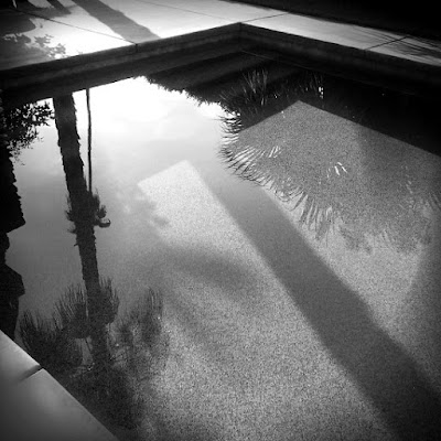
My trilogy on Palm Springs entitled ‘Debris’ began as a single novel but quickly morphed into a three-book package when the content demanded more pages. The first novel began with a black and white photo of my swimming pool. Vida carefully added the lettering of ‘Debris’ and an additional water splashing effect on top of it.
Later
on, she took some of my old photos around the area and made them into covers
for the two additional books in the series.
My
latest novel ‘Playground for the Devil’ proved a challenge in that we had
several areas to highlight. I wanted to show the cabin in question, the Big Sur
area and the San Francisco location for the boutique publishing firm where my protagonists
worked. Two out of three proved the right formula.
Vida
and I went over dozens and dozens of royalty free photos along with my own
collection of photos of Big Sur. The idea was to capture the dark side of the
area with its storied history, back canyons, deep penetrating forests, and odd
assortment of characters who have lived there over the years.
We
chose a generic picture of the Big Sur coastline and then tinted it with a
reddish-black effect. The front cover enjoyed the same tinting effect but with
multiple layers of images.
‘Polly’s Amorous Adventures’ was easy enough to design for the Showbill cover. Three figures told the story we wanted to hint at. But it wasn’t enough for our overall promotional effect. Talented friends of our group ‘Script2Stage2Screen, came up with a delightful ad poster that ‘said it all.’
The challenges continued with PTV and for now, we’ve got two covers to choose from.
Tangled Roots looks like a winner but ‘Widow’s Waltz,’ ‘Wake; the Musical’ ‘Frenchy’s Eats’ and some other first draft plays are still in the embryo stages. They say words tell a story. I’ve got that part down now but it’s that one emotional jolt readers get with the ‘right’ picture that I’m looking for with everything I write.


No comments:
Post a Comment